Home > Portfolio > Print > Posters > Cherry Blossom Festival
Cherry Blossom Festival
The Project
This project centers on designing poster elements using Adobe Illustrator, with the objective of producing two distinct yet stylistically cohesive posters for a public event.
In addition to a shared typeface, key visual elements—such as cherry blossom petals, a cherry blossom branch, and a silhouetted background—were carefully selected to unify the overall design.
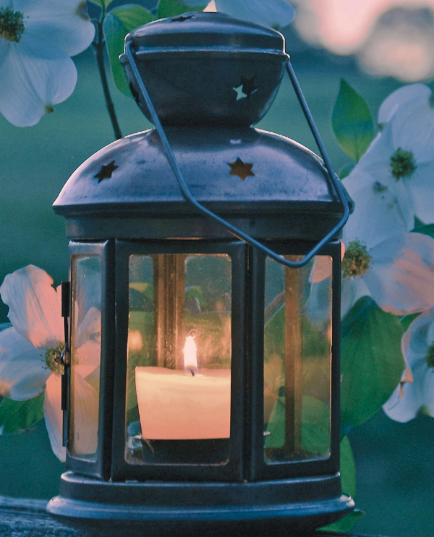
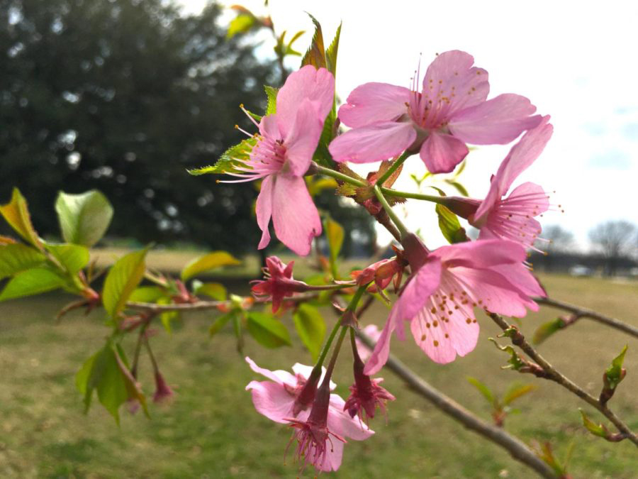
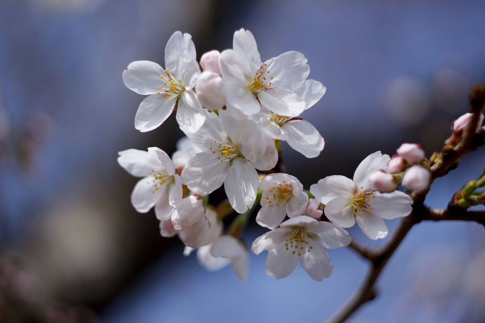
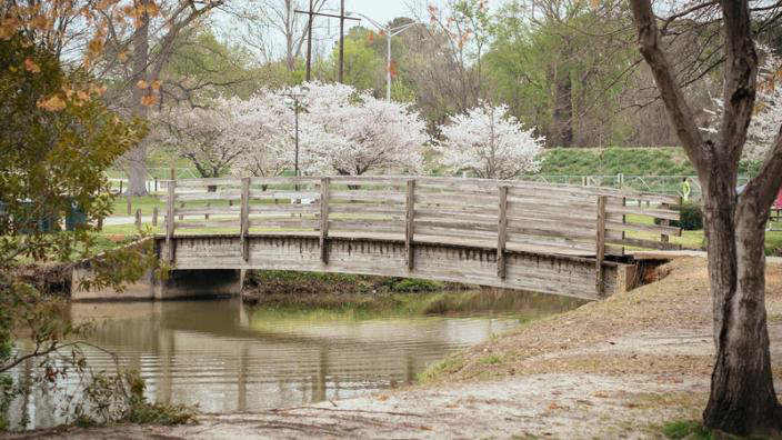
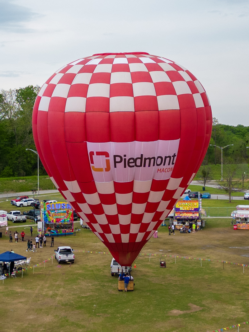
Research
The initial phase of the poster design involved researching the festival’s official website, Facebook page, and available imagery of the event and its location. Many of these visuals served as reference material for key design elements incorporated into the posters, such as the cherry blossoms, lantern, and hot air balloon.
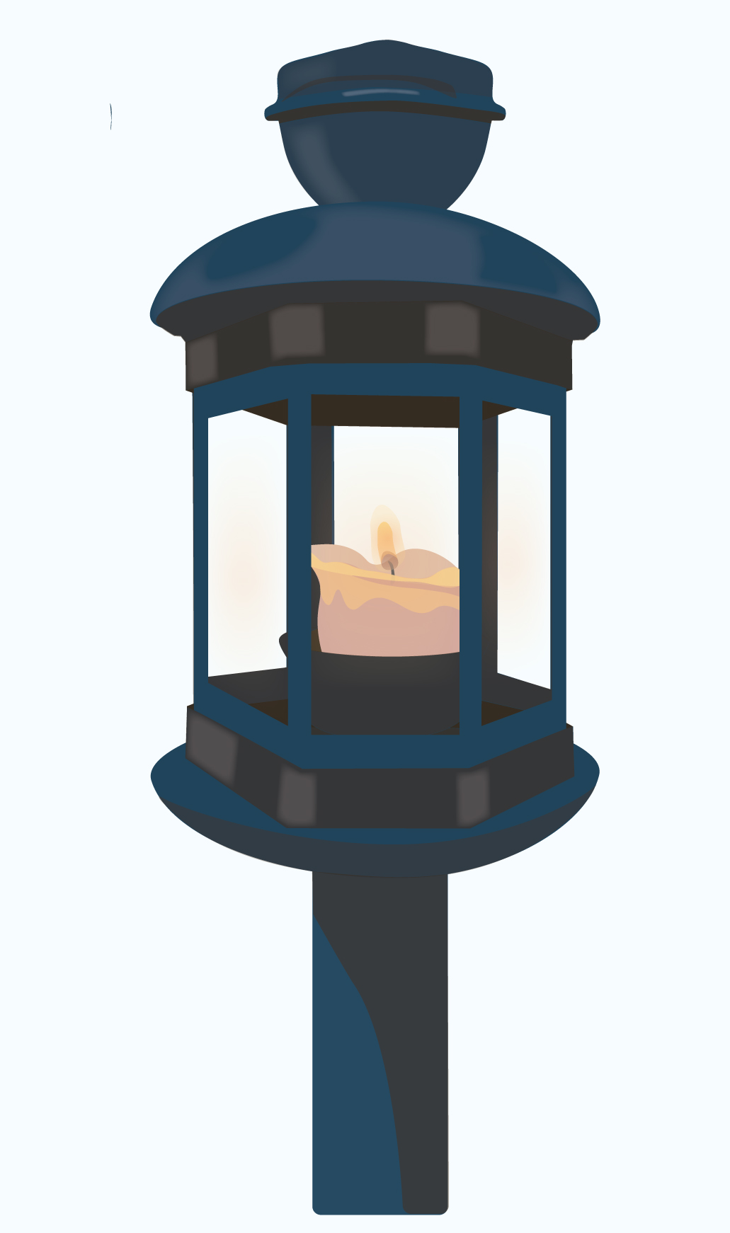
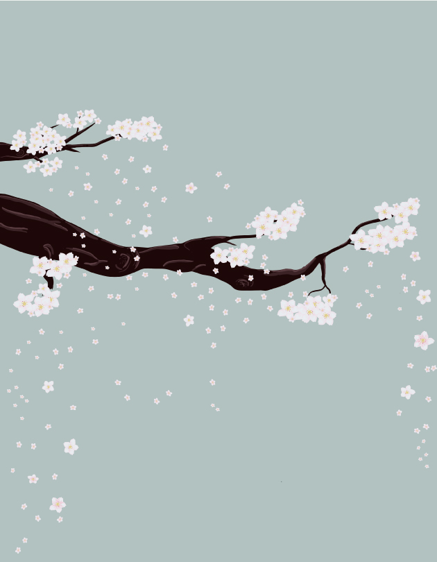
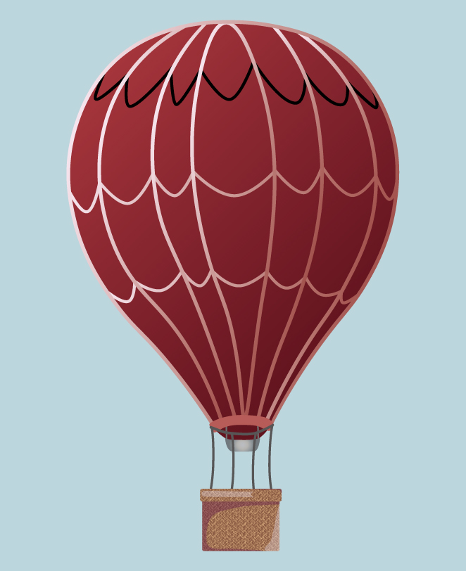
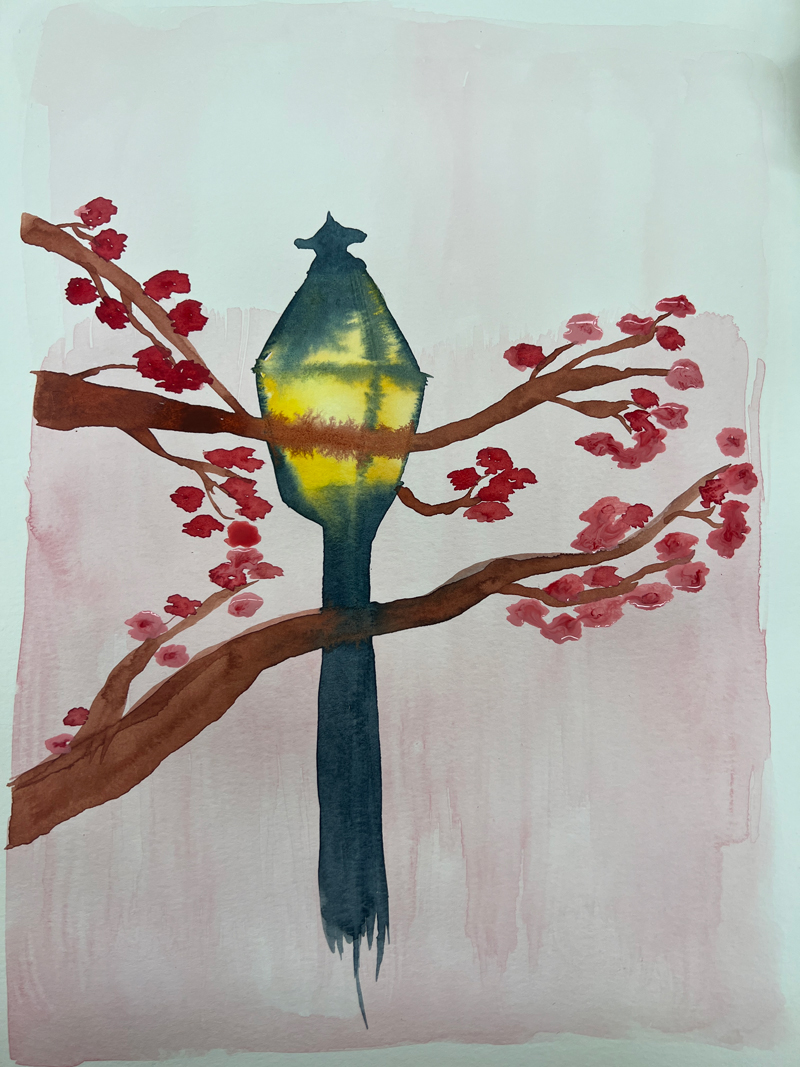
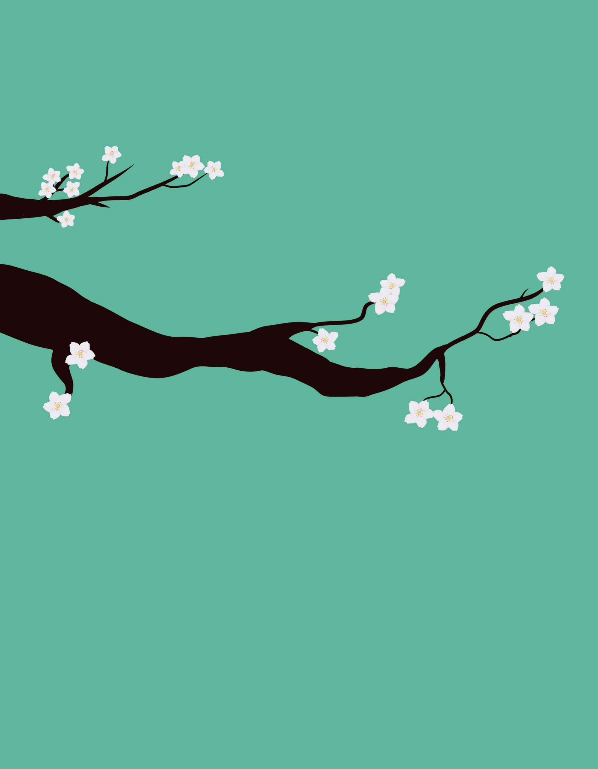
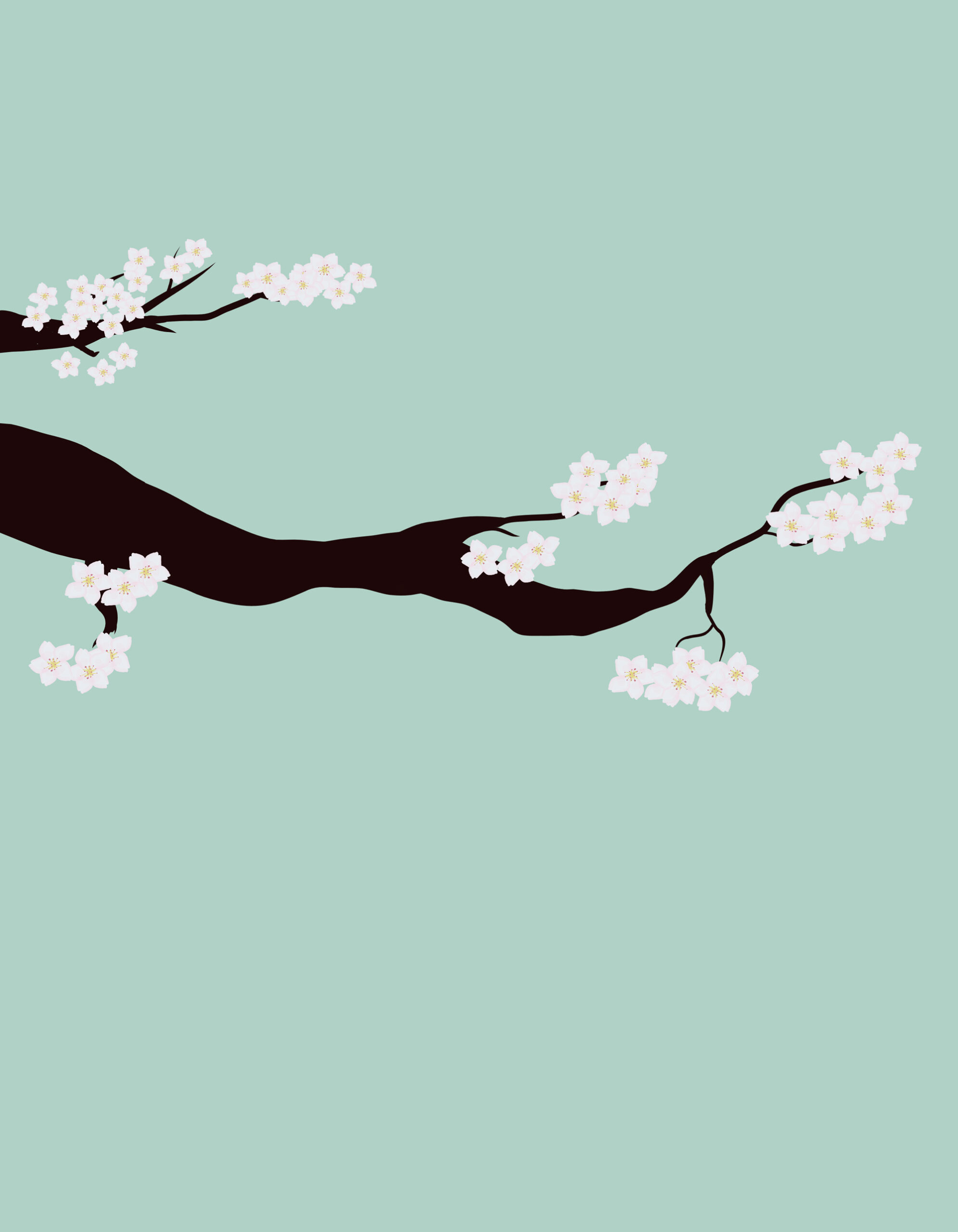
Sketches
The next phase involved developing a rough concept sketch for the posters, beginning with a quick watercolor study that informed the overall composition. From there, individual design elements were created.
The lantern was constructed first, using layered solid colors to define shadows and highlights. The cherry blossom branch and petals were then designed with a combination of the Blob Brush and Pen Tool. Following that, the background silhouette was composed using basic shapes and the Blob Brush to establish depth and structure. The final element, the hot air balloon, proved more intricate than the lantern, requiring a custom pattern to be designed from scratch for the basket.
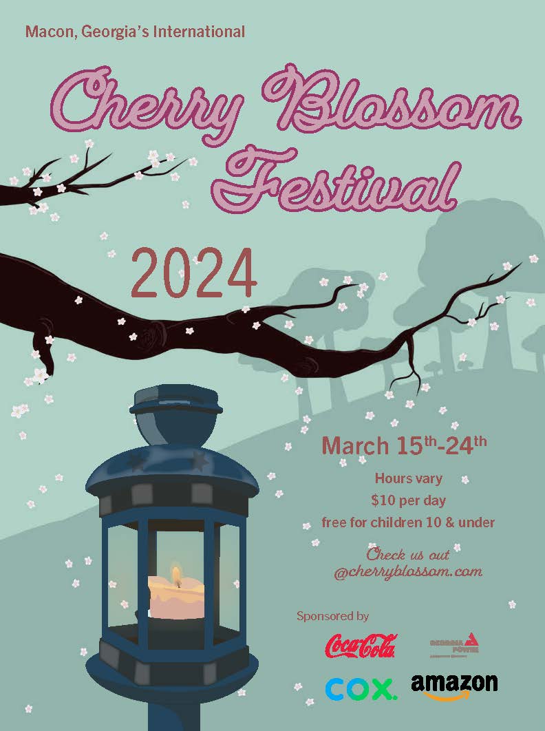
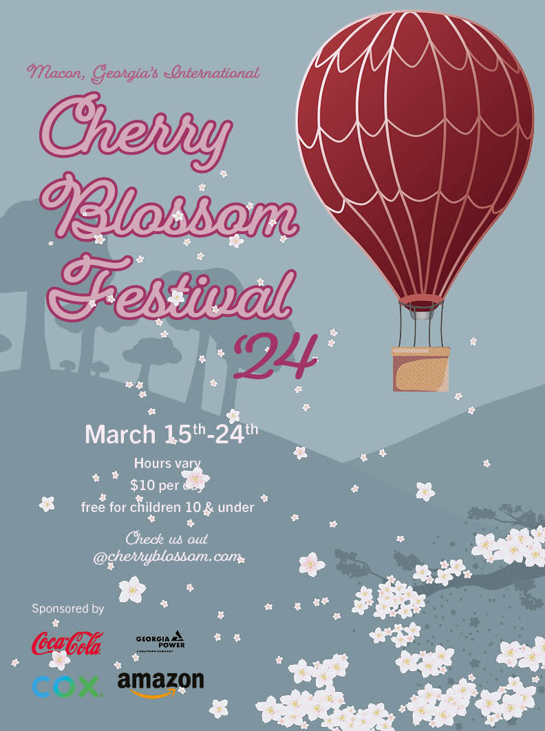
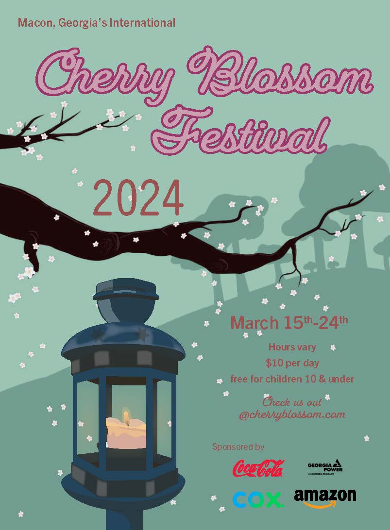
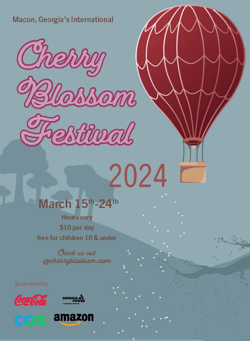
Colors
The color palette was directly inspired by the reference images. Pinks and reds were drawn from the cherry blossoms, while deep blues were used for the lantern. Even the dominant background hues were selected based on tones present in the source imagery.
For the hot air balloon poster, a blue sky was chosen to complement both the setting and the lantern, creating visual harmony. In the lantern-focused poster, a muted green was used to contrast with and enhance the cherry blossoms and lantern. Both the blue and green tones were intentionally subdued to ensure they did not overpower the primary visual elements.
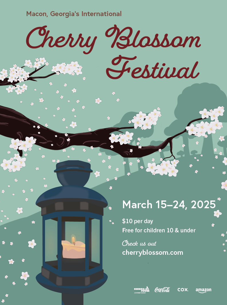
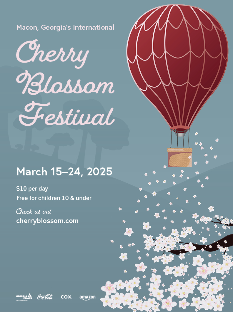
Drafts
The final stage of the process involved assembling all design elements into cohesive compositions. Several adjustments were made during this phase, including the addition of petals to the lantern poster and modifications to the typeface. The completed posters, reflecting these refinements, are presented above.