Home > Portfolio > Print > Posters > Movie Poster
Home > Portfolio > Print > Posters > Movie Poster
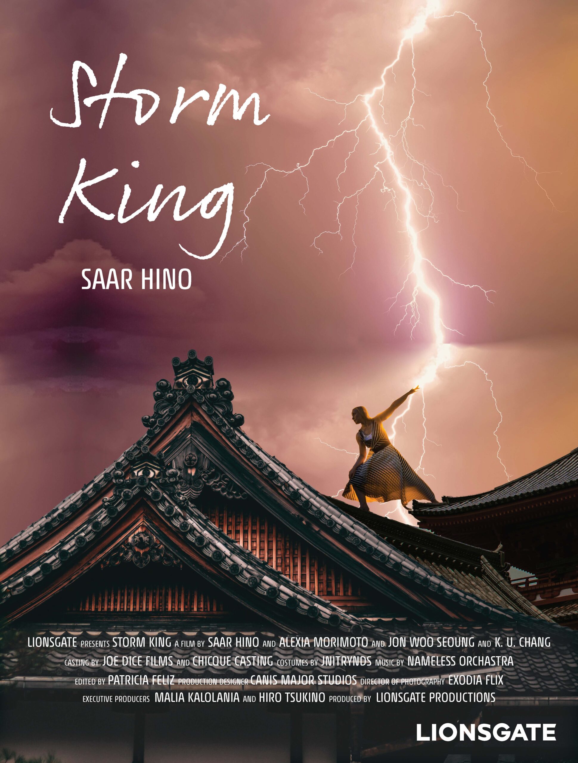
Movie Poster
The Project
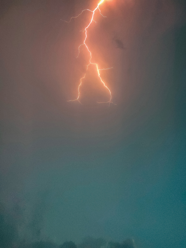
Storm King is a supernatural action film. It is targeted towards those in their late teens to late twenties. As this movie’s focus is on a female heroine capable of controlling lightning, it was important to choose a scene from the film that showcased the heroine. The scene chosen depicts a pivotal moment where the audience sees Saar’s strength in her kingly role.
Saar’s stance combined with the lightning was used to add a dynamic line for the eye to follow. The script used for the title mimics Saar’s signature. The color palette was kept simple with yellow lightning used as it’s one of the rarest colors of lightning bolts. The hints of violet references Saar’s royalty while the darker tones hint at the edginess of the movie.
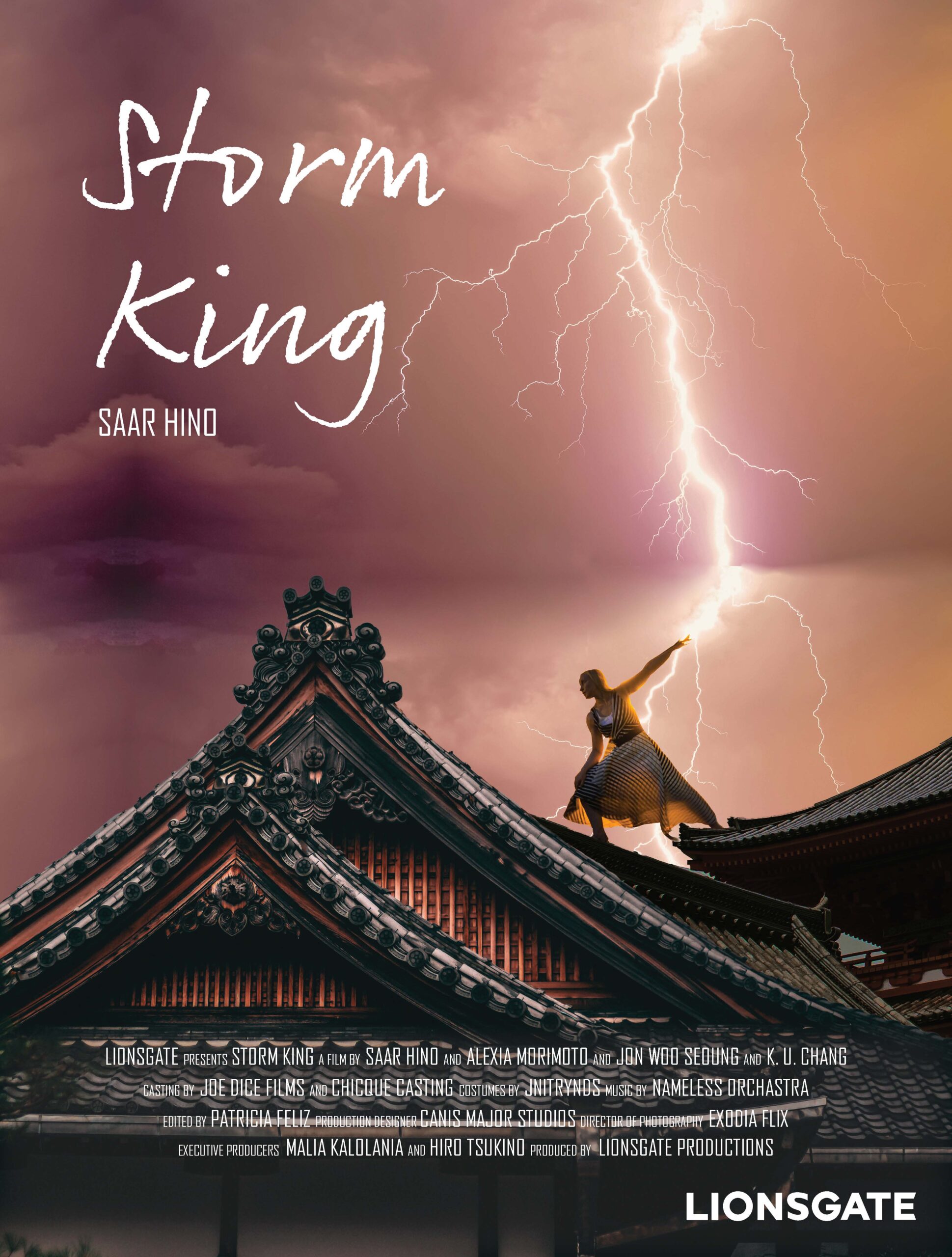
Movie Poster
The Project
Storm King is a supernatural action film. It is targeted towards those in their late teens to late twenties. As this movie’s focus is on a female heroine capable of controlling lightning, it was important to choose a scene from the film that showcased the heroine. The scene chosen depicts a pivotal moment where the audience sees Saar’s strength in her kingly role.
Saar’s stance combined with the lightning was used to add a dynamic line for the eye to follow. The script used for the title mimics Saar’s signature. The color palette was kept simple with yellow lightning used as it’s one of the rarest colors of lightning bolts. The hints of violet references Saar’s royalty while the darker tones hint at the edginess of the movie.

Images
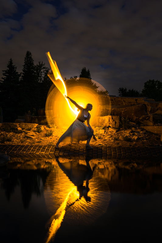
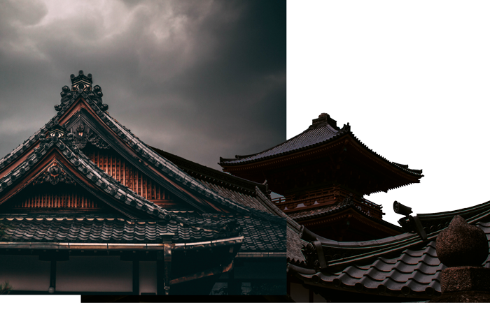
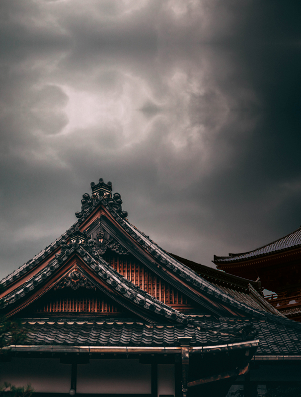
These were the provided images for the project. The objective was to create a cohesive poster design using elements from this set, though not all components from the original photos were incorporated.
Images
These were the provided images for the project. The objective was to create a cohesive poster design using elements from this set, though not all components from the original photos were incorporated.
Photoshopping
Various elements were extracted from the provided images to create the final composition. The two buildings were merged, and the woman was isolated from her original background. Once combined, the color tones of each component were adjusted to achieve a cohesive and balanced final design.
Photoshopping
Drafts
After constructing the overall scene and applying color correction, text was added to the composition. The poster underwent multiple revisions to determine the most effective placement of the copy. The final version is displayed at the top of the page.